Need help choosing a headshot!
Sunday, February 24, 2008
Since I have to have a new headshot turned in by March 1, I need y’all’s help!
Friday, I had my photoshoot! I’ve chosen some of my favorites and I’d love your feedback on which you think I should send to Barbour for my marketing materials (click on image to view full-size–and these are the raw images–the background will be cropped/photoshopped to make sure it’s plain) . . .
Photography by Melinda Rathjen; photoshoot director, Georgina Chidlow Rucker.
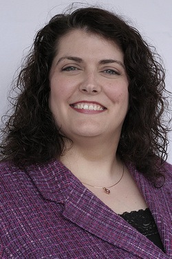
1.
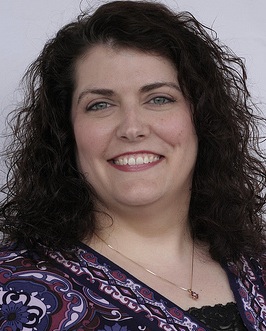
2.
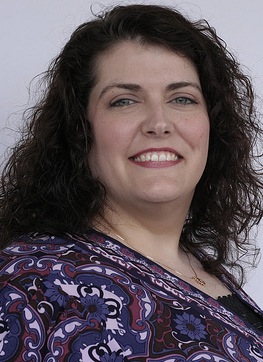
3.
4.
5.
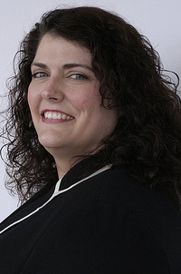
6.
7.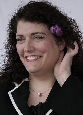
8.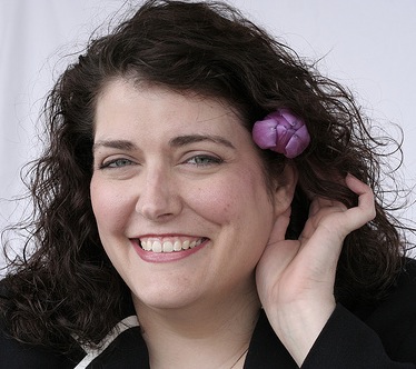


I love the last two, with the flower in your hair (7 & 8)! 🙂
Venessa
LikeLike
Hey, gorgeous girl!
I think for the book cover, they’d probably want a serious one, so I’d vote for #3. Behind that, #4 and #8 are my favorites.
LikeLike
I would also vote for #3. It looks the most natural to me.
LikeLike
They are all beautiful. Casting for #3 and #8.
LikeLike
Hi Kaye–I vote for 3 or 7!
Julie
LikeLike
My picks are 4 and 8.
LikeLike
#3 is more natural and could be cropped a bit, 4 is also great. I like 8 but your hand might not come thru as that — just a “what is that next to her ear beside the flower?” Although I do really like your expression. CONGRATS on your new book!
LikeLike
I think my favorite is #3. Great pics!
LikeLike
Great outfits, smiles, and photos.
I think the off-center photos are the ones that seem most dynamic, so I’m voting for 6 & 8.
The shots where the strips of tape are visible in the background might be something to reconsider.
LikeLike
Kaye:
I’m partial to #2 because every feature of your face is beautifully balanced and relaxed and #8 because it shows the same beauty, but with some whimsy added in.
Have fun choosing!
~Heidi
LikeLike
I like four and eight–they sparkle.
LikeLike
I choose either #2 or #3. Great pics, btw. You’re gorgeous!
LikeLike
Kaye–
I’d go with #3– elegant and relaxed yet professional.
Congratulations on the book, again!
Monica
LikeLike
Hi Kaye
I really like #3, I think it’s great for a book cover/jacket. I like the one you chose to put at the top of this blog, i think it’s a great blog photo, but I like #3 the best for your book.
Great pictures! It was tough to choose 🙂
-Rhonda
LikeLike
Hey, how did I not know you were having a photo shoot. Communication, friend! Anyhoo, I absolutely adore #3 and #7. These are great shots! You can’t go wrong with any of these.
LikeLike
Number three, hands down!
LikeLike
I’m torn between 4 and 8. Both are great because your expression is very warm and genuine, as if you were caught laughing. I don’t think you could go wrong with either one and it’s probably a question of how much of a closeup you want.
LikeLike
Good point, Anne–I prefer the ones where I’m either laughing or it’s a little farther away . . . can’t see all the flaws then!
LikeLike
My favorites are #3 and #8. What a difficult choice, though–great shots!
Shelley
LikeLike
I like 8 best cause it has personality. Both 7 & 8. Then my next choice is #3 😀
LikeLike
PS: Don’t know if you want it o r not, but if you wanted to see an image with the background clean (no stripes) I’ve got great Photoshop skills 😀
LikeLike
#8 shows loads of personality. Playful and fun. That’s my vote.
LikeLike
#3!!!!
LikeLike
I have dealt with headshots and TV appearances a lot.
I would stay away from the busy top as it distracts from your lovely face.
Crop any shot you send so that the focus is on your face only. Be sure the tape on the wall is cropped out of the shots!
I would pick number 1 or 6. They both look professional and you look smart and successful, like someone a reader should listen to!
I would crop six so that the focus is on your face only. You want to look right at the reader from the pages with a warm, knowledgeable yet approachable smile.
Good luck.
Nancy
LikeLike
Number 3 all the way!!
LikeLike
I like three and seven the best. Three is professional yet warm, and seven is very natural and fun. They’re all great photos, though. 🙂
LikeLike
Nancy, good point about cropping. I didn’t take that into consideration when choosing. But the focus on Kaye’s face in #8 was one of the reasons I like it best. If the others were cropped, I might make a different choice.
LikeLike
I’d say 3 or 4, depending on the look you’re going for.
As a photographer I think that there is too much wasted space on the tops of 2 and 4, and if you submitted the 4 I’s suggest cropping the top to be more like 3 or 7.
I think you look tired in 2, 5, and 6, and the others are adorable, but 3 or 4 would make the best back of the book shots imho ;o)
LikeLike
I like #1. You look relaxed and professional.
LikeLike
#8. Shows your personality and suits a romance writer.
LikeLike
The last one, the one you’ve put up in your Header.
LikeLike
I like 3 and 4.
LikeLike
I like #3 and #8.
LikeLike
Kaye,
I vote for #3. Professional, yet relaxed. No gimmicks, looking the viewer right in the eye.
Congratulations and best wishes!
LikeLike
I like #2. It’s flattering and professional
LikeLike
# 3 hands down!
LikeLike
Almost all great, I like 3 & 8. Congrats again!
LikeLike