Cover Models
 A few years ago, I had an idea for a story to which I gave the working title of Cover Model. The idea was a story in which the romantic hero was an artist who put himself through art school by painting covers for steamy romance novels. He was so broke that he couldn’t afford to pay actual models, so he used himself—slightly disguised—in the mock covers for his portfolio. And this character was inspired by the chef I thought should have won the second season of Top Chef, Sam Talbot.
The heroine—the romance novelist—liked these sample covers so much (as in, she was “inspired” by the guy in the images), she asked her publisher to have not just this artist but that particular model on the front cover of all of her novels.
Many years later, both have made changes in their lives—he’s teaching at a hoity-toity art college, she’s not writing the steamy stuff anymore (door-closed stuff only now)—and neither really want others to know what they used to do (they both used pseudonyms in the past). Thus our story begins.
Fast forward several years to 2009. I was in the process of completing A Case for Love, which meant I was about to complete my first three-book contract for Barbour. And they asked for a proposal for another series. I’d already started thinking about some of the story ideas I had somewhat worked up and how I could tie three of them together.
For the first book, I pulled what was actually my third complete manuscript, Love Remains, though I changed so much about it that I ended up using only one scene from the original manuscript—and still had to highly edit that!
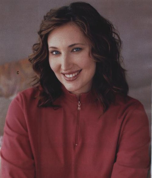
When I sent the worksheet for the cover in, here are the physical descriptions and reference images I sent for the hero and heroine:
A. Main Character #1: Bobby Patterson
Age— 34
Occupation— Tennessee Criminal Investigations Unit agent (former Army officer)
Hair Color—Brown
Eye Color—Hazel
Hair Style—Cropped (almost military style)
Clothing Style—Suits for work; button-down shirts, jeans for more casual looks
Overall Description (could include height, build, personal style, countenance, etc.)— 6’3” tall, works out regularly—broad through the shoulders, slim through the waist. His most distinctive physical feature is his very square and pronounced jaw.
B. Main Character #2: Zarah Mitchell
Age— 32
Occupation—Historical Archivist/former archaeologist
Hair Color—Brown
Eye Color—Blue
Hair Style—shoulder-length/curly
Clothing Style—professional
Overall Description (could include height, build, personal style, countenance, etc.)—5’7”, size 14/16, has a pronounced nose and full lips.
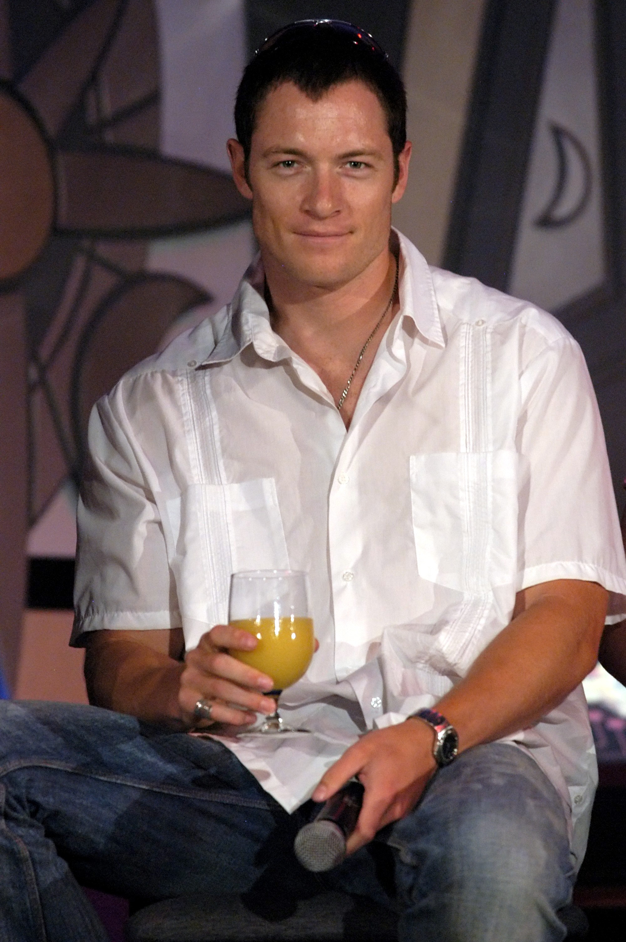
Now, because it had been mentioned to me that the covers for the new series would probably be similar to the covers for the Brides of Bonneterre series, I focused more on Bobby’s description than Zarah’s.
 Just before Christmas (or just after? don’t remember exactly, but it’s while I was in Baton Rouge the week before and after), I received this “rough” cover design with a request for my feedback on it. (And believe me, I felt important when I saw that request!)
My first thought was, Wow! That’s a book I’d pick up off the shelf to see what it’s about! My second thought was, Those aren’t my characters.
Since this was the first time I’d been asked for feedback, I took a few days to respond. I liked the design of the cover, but the characters didn’t look anything like how I’d described them in the story. So I started out with all the positives, what I loved about the design, colors, etc. Then I reattached the reference images and reiterated the written descriptions of the characters.
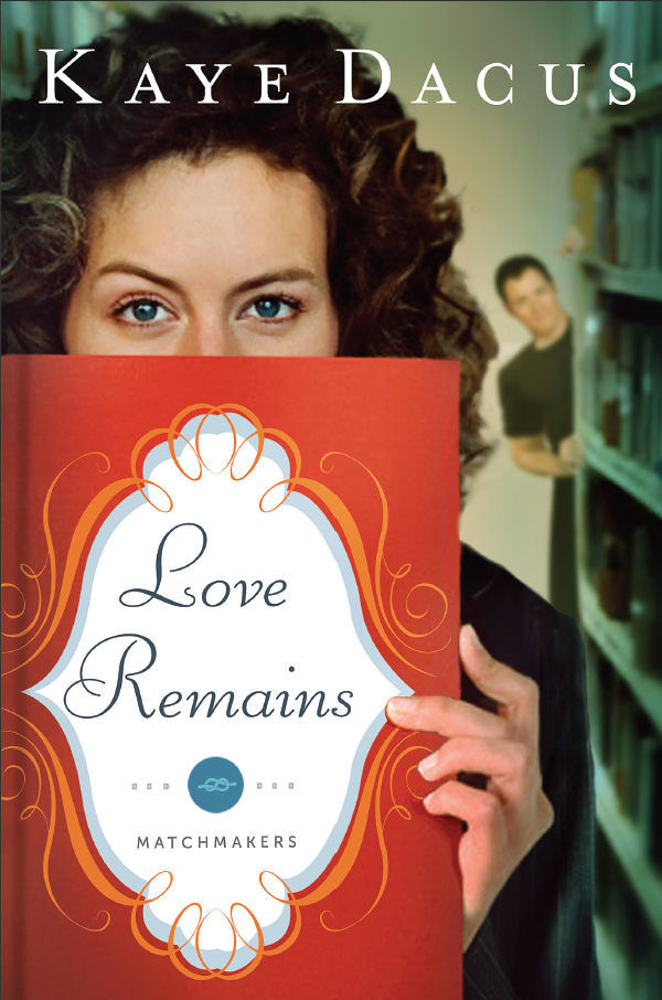
Several weeks and a few more changes later, and this is the working cover for Love Remains (with, I believe, a few more little design changes still being made):
One of the things that was stressed to me during this process was that they wanted to use stock images for the characters instead of having to do a photo shoot. So now that I knew in what direction the covers were going, I jumped onto my favorite of the stock-image websites, Jupiter Images (now Getty Images), and I found images that, while not identical to the actresses/models I’d been using as my Real World Templates, I liked. And I was still in the process of writing Love Remains, so I was able to adjust the descriptions of them in that book.
So, today, when I received an e-mail with an attachment of the “sneak-peek” of the cover of The Art of Romance (the story that I’d given the working title of Cover Model), I was thrilled to discover that they’d used one of the images of the model I’d found for Caylor on the stock-photo site!
Here’s the image from Jupiter Images:

And here’s an image I sent them as an example of what they could do for the hero—since I figured he’d be blurred-out in the background (since the guy in this picture doesn’t really look much like Dylan), as on the first cover:

And here’s the cover design they’ve come up with:

Comments are closed.


I love it!! I cannot wait to read these new books! I think the cover definitely inspires people to pick up a book and read the back at least, let alone buy. Thanks for including your readers in the process and excitement of your books!
LikeLike
Before I was published, I always wondered about the process of how covers get designed, so it’s nice to be able to “pull back the curtain” to show a little bit of how this happens.
LikeLike
I just looked closer at the first two covers. Are they, *gasp*, at a LIBRARY? 😀
That is so cool that they used your pic suggestion for “Art of Romance!” I am constantly amazed at the quality of cover art used in Christian fiction these days. There have been many (including “Stand-In Groom,” I admit) that I initially picked up just because the cover was enticing.
LikeLike
On the cover of Love Remains, yes, it’s somewhat library-ish . . . mostly because it would have been too hard to try to find a stock photo that would get across the idea of the fictional historical preservation agency she works at. But they do have document archives that would be lined with books, and at one point, I do have Bobby going to the State Library to do some research on his case.
LikeLike
LOVE them!! Those are definitely covers that would pique my interest. So excited for you, Kaye!
LikeLike
I admit, I was shocked when I saw the initial cover for Love Remains. I just couldn’t wrap my head around the fact that one of my books would have a cover that cute and eye-catching.
LikeLike
GORGEOUS! Can’t wait to start reading…
LikeLike
Thanks, Jodie!
LikeLike
I really like learning about the way this is done. So glad you got to have input. The cover’s are well done – I like!
LikeLike
Thanks, Carla!
LikeLike
So…what you’re saying is that the amazing-sounding Cover Model story won’t be out for a really long time.
These posts are supposed to be UPLIFTING, Kaye.
LikeLike
LOL—Love Remains will be out in August, but, yes, there is a wait for The Art of Romance. It doesn’t come out until next May.
LikeLike
SUPER interesting to read!
I love the cover for Art! LOVE LOVE LOVE it!!! How cool that you basically picked the images. WTG!
LikeLike
I actually squealed a little bit when I opened the image and saw CAYLOR—or at least the stock-photo model who’s become Caylor in my mind—on the front cover. While I know there’s no guarantee that if I choose images from a stock photo site from now on as my reference images that they’ll actually use them, I think I’m going to hedge my bets in getting covers I adore by going that route in the future!
LikeLike
I love it! The yellow gives it a bright and distinctive look fromt he other covers. It definietly looks like I will be pulling that one off the shelf at my neighborhood book store!!!
LikeLike
The irony is, even though background colors/moods were never discussed, and these covers were designed before the books were finished (or even started, in the case of Art), the colors of these two match the personalities of the girls to a T. Zarah (LR) is a little more calm, a little more sedate in her personality, while Caylor tends toward being somewhat more flamboyant and outgoing and . . . (wait for it) . . . SUNNY. 😉
LikeLike
Looking at the covers all next to each other on your home page they all follow the earth tones (green hues, blue and brown shades) BUT to see one with the brighter yellow makes it stand out among your works! Keep those cover artists on their toes!
LikeLike
I really love the color palette Barbour is using for The Matchmakers series…so eye-catching and trendy!
LikeLike
When I was working on the new “book stack” image up at the top of the right-hand column yesterday, I noticed a trend with my covers. They started out with somewhat muted colors, relatively conservative (SIG and RH, specifically). MFR, ACFL, and RC are a little bolder, with more depth and range of colors. And now, with LR and Art, I’m seeing much more cutting-edge, trendy, stylish, and, as we’ve already pointed out, BOLD colors. Loving it!
LikeLike
WOW! The covers are absolutely GORGEOUS!!!!!!!!!!! I can only hope for covers that good….SOMEDAY…. 😉 I think the cover designing part is soooo fascinating! Thanks for the peek!!!
LikeLike
I’m still a little shocked that the LR and Art covers are for books that I have written/am writing!
LikeLike
You’re so lucky to have that kind of pull with your publisher—and at their request! Aside from matching your characters better, I like the second cover for Love Remains better because it adds more “mystery” to the cover, with her hiding behind the book.
Congrats on great covers!
LikeLike
I think having the bottom half of the girls’ faces hidden makes a nice companion to the Bonneterre books where the top half of the guys’ faces are hidden.
Plus I’m loving them because I’m such an “eyes” person—that’s one of the first things I notice about people. You can learn so much about someone by paying attention to the subtle signals they give with their eyes.
LikeLike
I absolutely LOVE her eyes! That would encourage me to pick up the book – she looks like someone who will be FUN to know!
LikeLike
LOVE, LOVE, LOVE it! I would definitely pick out this book to read…with any of the possible covers! It’s so incredibly interesting to read about the “behind the scenes” in the book publishing process. Thanks for giving us a glimpse!
LikeLike